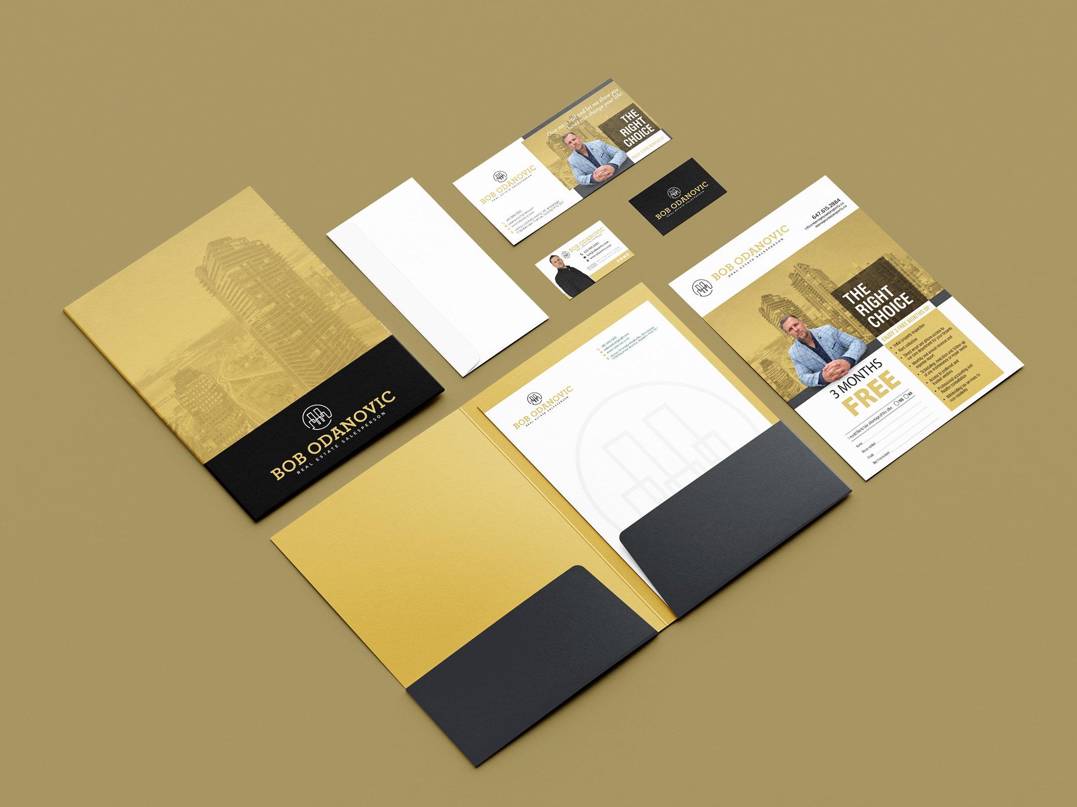
Bob Odanovic, focused on client needs, has been serving the Greater Toronto Area since 2009. With strong analytical skills and a results-driven approach, he has built meaningful relationships, leading to growth from referrals and repeat clients. Bob sought a new logo and brand package that reflects his upscale and mature identity, moving beyond his original brand. He wanted a simple, clean wordmark and a custom emblem that is easy to recognize and central to his branding.
Brief
I wanted to incorporate Bob's initials into the emblem, but he preferred to avoid "B.O." So, I aimed to subtly include his initials while referencing the real estate industry and showcasing Bob’s creative problem-solving. The final design combined his initials, buildings, and a light bulb.
Solution
Logo Design
Visual Identity
Custom Design